
Aug '04 - May '05
I just finished my interview portfolio. I'm pretty happy with it overall. I chose to go with my same old format that I've been using for the past 4 years, but its been good to me. ie. numerous scholarships and graduate school acceptance. I've skimmed it down to the best of the best projects. I chose a hot pressed watercolor board for the cover. I left the ragged edge on on side and cut a large square out of the front cover revealing my name in a field of blue. Behind the front cover is a sheet of plastic (found in the fabric section of your local hobby shop. This sheet protects the the title sheet from scratches and nasty hands. I used a Tektronix Phaser 850 to print front and back pages. The phaser is a wax based printer so the 32 pound pages have a nice weight and luster to them. I've also added a fold out 11x17 appendix in the back for my thesis plans and elevations. There was so much detail in them that I just couldn't get them to look right at a smaller scale. I had my binding lady (at the small local bindery shop) spiral bind it in clear plastic. My previous version had a wire spiral that I scabbed off a Wal-Mart binder, but it just didn't give the look I wanted. Overall I've got a nice clean look that provides a nice layout to display each project. I chose to simplify the layout so the background wouldn't compete with my projects.
I've finished researching the firms that I'll be interviewing with Friday and am now working on some of the frequently asked questions. After that, I'll come up with a few questions for each firm and I'm set.
Here is a pic of the portfolio and a link to view it online. Let me know what you think.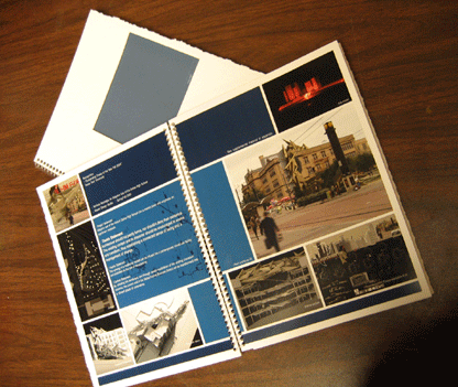
* click to view portfolio in PDF format (5.8MB)
Select the facing pages icon in the bottom right of your screen to properly view.
6 Comments
Thanks for posting your portfolio, my friend and I enjoyed looking at it...very thorough, you represent a wide range of capabilities and interests. Personal aesthetic opinions aside, the projects are presented clearly and effectively, which employers will surely appreciate. Good luck, you seem well prepared for professional life (MBA?)...
brian,
i remember when you were printing when i was running the computer lab, and it looks just as good to me now as it did then. one thing though is it suprises me that you can be so playful in most of your design projects, but so rigid in your portfolio. i can't argue with the clarity though. good luck when searching, and thanks for posting it. takes balls to post your work for all to see.
Thanks bud. Personally I think "playful" work like mine needs a simple rigid background. As far as posting goes... well I've always been out there. What you see is what you get.
Working in the print lab defiantly has its perks. Not that you care, but we just got a laser plotter, an HP 5500, a full size scanner, and have a few more things on the way. All thanks to tuition increases!
hey. just wanted to remark on the idea that 'playful' work needs a simple rigid background. i'd encourage you to extend your 'playfulness' into your graphic design; your friend is right, it doesn't really make sense to have self-contradicting styles on the same page. it is certainly more difficult to make a convincing 'playful' layout than it is to put everything in a neat little box, but then, it's easier to design our buildings as neat little boxes and we don't do that, right?
look closely at books about or by architects that you consider 'playful'. i think you'll find that, for the most part, the books' layouts/formats closely resemble the general architectural ideas contained within. wes jones, morphosis and lot-ek all jump to mind.
but, in general, good work, and good luck. :]
thanks for the comments joed. actually I have looked at some of the "playful" layouts/formats architects books. And in most cases there playfulness just pisses me off. Its one thing to create a creative image for quick viewing, however its another thing to create a book that conveys tons of information in a very short time period. Its not that I haven't considered creating a more "playful" layout. I've simply weighed my options and chosen not to. Thanks for the suggestions. I simply just don't agree. I'll check out lot-ek, I'm not familiar with them.
Hey there N H, Just had to say nice work. As for my two cents on the whole "playful" layout. I'd say you made a good choice. The contrast between the chaos in you work vs. the order of you layout works nicely together. Not to mention it plays well off your most predominant project, your thesis. Then again, that's just my opinion. Maybe you really do suck. Seriously though, I'm impressed.
Block this user
Are you sure you want to block this user and hide all related comments throughout the site?
Archinect
This is your first comment on Archinect. Your comment will be visible once approved.